Company
Date
Author of the children's book "If The Shoe Fits . . ."{
Author of the children's book "World of Ice Cream"{ 2022
Author of the children's book "Cyber Defenders"{
Author of the children's book "The Isle of Mull"{
Author of novel "New Horizons"{ 2021
Author of the children's book "The Sqirrels Tale"{
Author of novel "Fake News"{ 2020
Author of the chikdren's book "The Magic Calendar"{ 2019
Author of novel "Cyber Insecurity"{ 2018
Microsoft Cloud + Enterprise Team{ 2018
Author of novel "Killing Time"{ 2017
Wells Fargo{ 2017
RGDance.co.uk{ 2016
Amazon Web 2.0 Book, New Security Chapter{ 2015 - 2016
Microsoft Research{ 2015
Amazon published Web 2.0 Book{ 2013 - 2014
Wells Fargo{ 2011 - 2012
Microsoft Assistive Technology Group{ 2011
Microsoft IE Test Group{ 2010
MediRec.org{ 2009 - 2010
LJGArt.com{
Microsoft Research{ 2008 - 2009
Paciderm{
DISYS{ 2007 - 2008
Web2AJAX{ 2007
Intermountain Health Care{ 2007
Pharmax{ 2006 - 2007
ATQSystems{ 2002 - 2006
ISV{
iNetz / Bureau of Land Management{1998 - 2002
Modis{
Berger{ 2001
Interface / FBI / various other{1990s
Interface{
Bartel Software{
Norton Christiansen{1980s
AMF Scientific Drilling Controls{
AMF Scientific Drilling Controls{
Sperry Sun{1970s
Litton Industries{
Locations Worked
Abu Dhabi
Columbia
Dubai
Egypt
England
Greece
Iran
Malaysia
Mexico
Saudi Arabia
Scotland
Singapore
U.S.A.
Designing Testing and Debugging
There is no substitute for working from the earliest moment in
the medium that the final product will operate in, especially
when designing and prototyping web sites that will need to
operate in multiple different browsers.
For example, a design idea that may seem viable on a whiteboard,
may not work in some of the target browsers. This can result in
a different design having to be adopted when cross-browser testing
takes place and fails.
And physical whiteboards are too transitory and imprecise to be
truly useful and may actually be counterproductive, as one persons
interpretation of what was on a board may differ from the authors,
especially after the passage of a few hours, days, or weeks.
Also, they cannot be shared across remote locations.
So it's far better to to use the Agile design methodolgy on a computer
to fix bugs and design problems, frequently and early when a
minimum of changes need to be made to correct faulty assumptions.
Consequently, from the very beginning of a project I prototype
in HTML and JavaScript, and test and debug in all the main browsers
( IE, Firefox, Chrome, Safari, and Opera ).


Current Technologies Used
(D)HTML 4.01 and 5 / XHTML
JavaScript
AJAX
CSS
PHP
SQL
Testing, and Debugging
Databases ( e.g. MS SQL Server, DB2, Oracle, MySQL )
Hand coding using NoteTab editor with built-in version control
Soft Skills
Determining users needs and interfacing
between internal company departments and
customers, and proposal and technical writing
Cross-browser Development
Firefox ( Windows & Linux )
Chrome
IE 6, 7, 8, 9, 10, 11, Edge
Safari ( on Windows )
Opera
Server-side

Source : W3Techs.com - Nov. 2015
Client-side

Source : W3Techs.com - Nov. 2015


Data Source : netmarketshare.com - June 2016
Third-party JavaScript Components Used for In-House Library
Auto-complete text dropdown - actb.js
Image fade in / out - fader.js
Graphing - graph.js
Tree Control ( expandable ) - TreeView.js
Rounded Corners - CurvyCorners.js
Calendar - DevX Calendar
Drag / drop - QuirksMode_Drag_Drop.js
Table Sort & Scroll / Fixed Head- Jaimon Mathew
AJAX - Various
Mapping & Geocoding - Microsoft / Bing Maps
And these components allow a single code base to be used with all the browsers, with no need
for large third-party libraries that bloat web pages so much with their "core" files. For example,
in a comparison done with JQuery on an actual site, my in-house library occupied about 60Kb - 70Kb of
code for the same functionality as JQuery required 600Kb - 700Kb.

Source: LibScore.com Dec. 2014
Design Skills
My focus is on the User Interface ( UI ) running in client browsers in a cross-browser environment,
and I use JavaScript to program HTML web pages that provide the desired User Experience ( UX ). I use
a subset of JavaScript that works across all the common browsers, Internet Explorer 6, 7, 8, 9, 10, 11,
Firefox, Chrome, Safari, and Opera, and I layout pages with CSS positioning.
I use the capabilities of the flexible, hybrid JavaScript language to produce easy-to-use
UI / UX designs, in conjunction with Graphic Designers for the front-end look and feel or
desired corporate appearance, and DataBase Architects for the back-end server-side interactions.
See the example of a simple widget / page that I wrote in a day from the image to the left, and
click here to see the actual widget I coded.
As Douglas Crockford the JavaScript guru and author says, "JavaScript is fundamentally about
objects". But I don't focus on particular programming methods - Object Oriented Programming ( OOP ), Model View Controller ( MVC ),
etc. - that don't themselves make web sites User Friendly. Instead I focus on how pages work and interact with users.
I design web sites manually, just as as I hand-code all my work without IDEs, and I don't use
third party libraries such as JQuery, Bootstrap, Angular, Backbone, YUI, or CoffeeScript, as they
bloat sites enormously with their need for "core" files before any functions can even be declared. Also
see the CoffeeScript article
for an explanation of why using that isn't such a good idea.
And if programming the back-end myself, I use PHP pages on the server, called with AJAX from the front-end,
for example to run SQL queries on databases, asynchronously in the background. And the same technique
is used for mashups at remote web sites, file transfers, etc. I don't use Java on either servers or
browsers because of the security, legal, and operational issues with it, that can be avoided with other
languages.
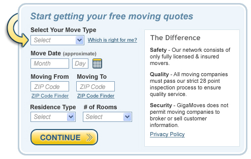 Provided .jpg Image file
I'm interested in technical writing and web development positions ( either contract or permanent ), preferably in the Pacific Northwest
where I live, that will combine the best of Web 2.0 design methods with hands-on, cross-browser front-end design and coding, and content writing. These
may be either on-site or remote.
And what I mean by Web 2.0 design methods, is using JavaScript and AJAX to implement "master-page"
web sites that need few if any whole page reloads to refresh content. AKA Single Page Applications
( SPA ). The Web 2.0 model separates functionality into client-side browser-based tasks
( typically about 3/4 of the code of database-backed sites ), and server-side tasks that are
called asynchronously in the background with AJAX, such as database SQL queries that absolutely
require visits to servers across the internet.
Instead of focusing on arbitrary architectural patterns for designing and programming web
sites, such as Model-View-Controller ( MVC ), Object Oriented Programming ( OOP ), or whatever
the "catch-phrase du jour" happens to be, I try to ensure that sites are easy to use, adaptable
to different screen sizes, and responsive to user inputs such as menu selections. And I'm
not concerned about whether JavaScript is object oriented, procedural, functional, or a mixture
- it's designing and building an easy to use and intuitive User Interface that's important to me.
To accomplish this in the most universally employed way, on the client I use HTML and CSS to
build the structure of web pages / sites, along with JavaScript and AJAX to provide
interactivity, and for server-side tasks I use PHP.
I think in terms of cross-browser design and coding, and I've developed my own compact library
of stand-alone functions that conform to this design model, rather than using bloated
megabyte-size third-party libraries or frameworks. I code according to the W3C standards
for HTML 4, XHTML, and HTML 5, and I use CSS positioning to lay out designs.
And I perform light graphical operations such as cutting, cropping, and pasting screen shots
and images, and ideally I'd work with a graphic artist / designer to develop sites that meet
the requirements for both appearance and functionality. I also write manuals for the
software that I produce, and I've written a book published by Amazon, titled "A Practical
Guide to Developing Web 2.0 Rich Internet Applications".
So, if you feel that the technologies described here might help your project, let me know!


